It’s here!

Screen shot 2014-05-04 at 5.36.42 PM

My new website is finally complete! After hours of slaving over a hot MacBook, my baby is live (with lots of cute puppy illustrations to boot!)

Without further ado…

www.sarahlambertportfolio.com

Enjoy browsing around and don’t forget to leave me a friendly message under the contact tab!

Designing for Scanning, Not Reading

cat-cover

In his book “Don’t Make Me Think,” author Steve Krug emphasizes a point I already subconsciously knew: Web users don’t read, they scan. They scroll, they browse, they click, but they do not read. As Krug points out, years of scanning magazines, newspapers, as well as new media like Facebook, Tumblr, and Reddit has made us more adept at scanning websites (22). But what does this mean for building my own site?

Continue reading

Writing Web Content That Works

pinterest

It’s no secret that I love to write. Why would I be a communication studies major if I couldn’t stand the written word? But I’ll let you in on a little secret: I love me a website with no words. Tumblr is my jam. Pinterest is my visual escape. Pretty pictures are my M.O. So when Ginny Redish explains that users love web content that works in “Writing Web Content That Works,” I completely understand. I may be a site designer, but I’m primarily a site user. And I don’t have time to waste when I’m procrastinating writing a research paper and want Yahoo! Mail to load faster.

Continue reading

Scope & Strategy

88bcfd1e1eb55b281d7c2b34e9d5acea

First and foremost, I would like my website to display all my creative accomplishments in an engaging and visually appealing way. I don’t have an online portfolio, save for slambertillustrates.blogspot.com, so it would be awesome if I could create a professional looking website that also displayed my writing.

I’d like my site to be somewhat interactive, but there’s something to be said for simply scrolling through a page and gathering information. I’m not a big fan of websites where tiles are turning every few seconds and the navigation is overwhelming. Simplicity is very important to me for this site.

I feel like it’s hard for me to plan in advance what I want this site to look like and accomplish. I think part of my creative process is just getting into the project and letting my creative conscience take over. Does that make sense? I have a certain design style that isn’t readily apparent to me, but it seems like all of my creative works are cohesive, so I’m confident that this website will be an extension of that.

I plan to use wix.com because it looks very user-friendly and I’ve played around with a template that I love. I’m excited to customize everything and get the ball rolling on this final project!

The User is Always Right

tumblr_mntt6r9Lcc1qz4d4bo1_500

To begin, I love author Jesse James Garrett’s style of writing. In the first chapter of his book “The Elements of User Experience,” he writes about the importance of product design. Not just product design– good product design, functional product design. I appreciated that he practiced what he preached; Garrett’s voice is engaging, informative, and relatable. In other words, a good product.

Continue reading

Point of View

Baz-Luhrmann-camera

For years it was a mystery to me that crappy movies could be made. Millions of dollars are funneled into Hollywood blockbusters, yet some big-budget movies are downright horrible. Confusing plots, miscast characters, and un-lifelike dialogue are common ailments of some of the most anticipated films. I spent all summer working at a dine-in cinema, wandering in and out of packed theaters watching the awfulness unfold. It took me a while to solve this mystery, but the answer is easy to any artist who has been subjected to constructive criticism and extensive editing: if a creation lacks a strong vision, nay, a strong point of view, the work will crumble.

Continue reading

Figure & Ground: Easier Said Than Done

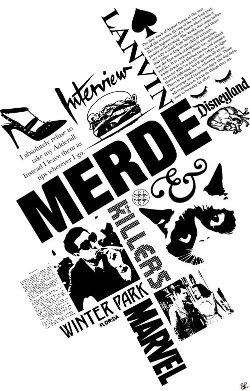
Merde

One of my more successful figure/ground pieces from Visual Foundations

This semester I’m taking an introductory level art class, Visual Foundations. While I took several years of  art in high school, I was unprepared for the slightly off-beat exercises my professor tasks us. I was even more surprised by his harsh grading of the class’s artwork, especially my own. I’d always had a knack for art and these projects seemed relatively simple; what were my pieces missing?

I’d estimate that we spent three weeks of the class talking about the importance of figure and ground in a composition. I assumed figure/ ground happened organically. I didn’t have to plan for it, or even understand it completely in order to have an aesthetically pleasing piece. After several unsuccessful compositions, I learned the hard way that there is a method to the figure/ground madness.

Continue reading

The Magic of Editing

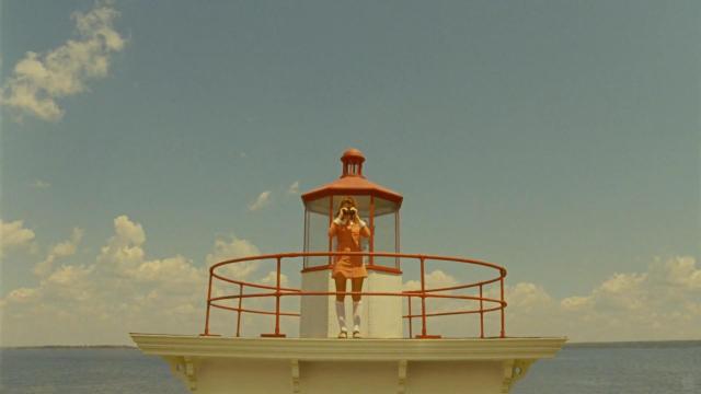
moonrise-kingdom-lighthouse

In “Visual Storytelling,” authors Ronald J. Osgood and M. Joseph Hinshaw begin the chapter “The Aesthetics of Editing” by quoting director Louis Malle:

I keep telling my editors, if you win an award for editing, I won’t work with you anymore. Your editing shows.

I found this chapter to be very illuminating; like Malle implies, we often don’t notice good editing because it is entirely intuitive. I therefore didn’t realize the diversity of techniques and shots that go into editing, or how editors make those selections. I’m a very visual person, so if I were to shoot a film, I’d venture to say that I would have an artistic eye when it came to setting up the shot. But that’s because it would be my vision and I would be editing the film.

Continue reading